Where have you been last summer ??
Its no secret that Google has been watching us all the time. I like Google though, because they allow us to access quite a lot of data that they collected on us.
Your own location history can be downloaded from your Google account under https://takeout.google.com/settings/takeout. Make sure you only tick “location history” for download, otherwise it will take super long to get all your Google data.
The data Google provides you for download is a .json file and can be loaded with the jsonlite package. Loading this file into R might take a few minutes because it can be quite big, depending on how many location points Google had saved about you.
Google data comes in .json format and we can use package jsonlite() to load and explore the data.
I am going to use Plotly and Mapbox to get clickable map and followed the steps as suugested below to set them up.
Step -1 : In order to use their API’s please make sure you have made accounts on both plot Plotly and Mapbox.
Step -2 : To create mapbox maps with Plotly, you’ll need a Mapbox account and a Mapbox Access Token that you can add to your Plotly Settings.
Step -3 : Now set your Mapbox Access Token (get here) and Plotly API Key (get here).
Loading the relevant libraries :
library(jsonlite)
library(plotly)
x <- fromJSON("LocationHistory.json")
Passing tokens to use Plotly and Mapbox.
Sys.setenv('MAPBOX_TOKEN' = <YOUR MAPBOX TOKEN>)
Sys.setenv("plotly_username"=<USER NAME FOR PLOTLY >)
Sys.setenv("plotly_api_key"=<API KEY FOR PLOTLY>)
If you’ve no experience in API’s don’t worry !! In simple words , above codes let R , Plotly & Mapbox talk to each other.
The date and time column is in the POSIX milliseconds format, so I converted it to human readable POSIX.
Similarly, longitude and latitude are saved in E7 format and were converted to GPS coordinates.
# extracting the locations dataframe
loc = x$locations

# converting time column from posix milliseconds into a readable time scale
loc$time = as.POSIXct(as.numeric(x$locations$timestampMs)/1000, origin = "1970-01-01")

# converting longitude and latitude from E7 to GPS coordinates
loc$lat = loc$latitudeE7 / 1e7
loc$lon = loc$longitudeE7 / 1e7
Let’s see, since when google is watching you 
min(loc$time)
[1] "2013-02-27 08:46:49 CST"
So , google is watching me since Feb, 2013.
max(loc$time)
[1] "2017-05-06 23:14:06 CDT"
Great, so it has my recent data too..
And how are the datapoints distributed over days, months and years?
Let’s calculate the number of data points per day, month and year
library(lubridate)
library(zoo)

loc$date <- as.Date(loc$time)
loc$year <- year(loc$date)
loc$month_year <- as.yearmon(loc$date)

points_p_day <- data.frame(table(loc$date), group = "day")
points_p_month <- data.frame(table(loc$month_year), group = "month")
points_p_year <- data.frame(table(loc$year), group = "year")
How many days were recorded?
nrow(points_p_day)
[1] 249
How many month were recorded?
nrow(points_p_month)
[1] 13
How many year were recorded?
nrow(points_p_year)
[1] 4
Let’s make some fancy graph through plotly
points <- rbind(points_p_day[, -1], points_p_month[, -1], points_p_year[, -1])
#  loading library
library(ggplot2) # for plotting
library(ggmap)  # for google maps
library(htmlwidgets) # helps saving  the HTML output ot the disk


p<- ggplot(points, aes(x = group, y = Freq)) +
geom_point(position = position_jitter(width = 0.1), alpha = 0.1) +
geom_boxplot(aes(color = group), size = 0.5, outlier.colour = NA) +
facet_grid(group ~ ., scales = "free") +
labs( title = "How many data points did Google collect about me?")+
theme(legend.position="none")


q<-ggplotly(p)
q

## Let's save the  plot as HTML
saveWidget(q, file="ch1.html")
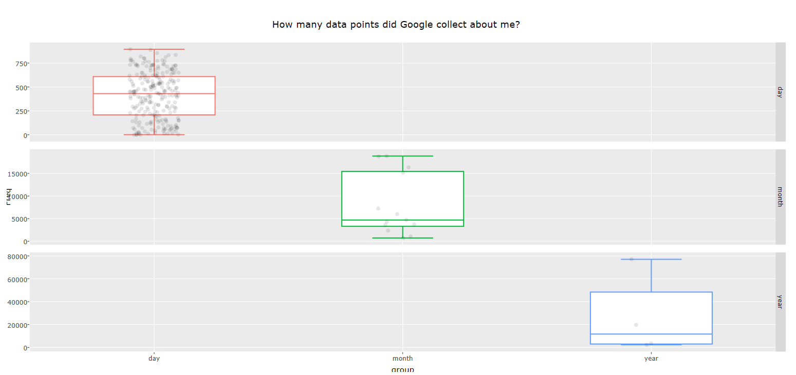
Click on the above image to seet he clickable and drillable chart. If you explore the chart , you can see that , Google colllected nearly ~430 points on me per day.
Location history
loc_map_1 <- loc %>%
  plot_mapbox(lat = ~lat, lon = ~lon,
              split= ~year, size=2,
              mode = 'scattermapbox') %>%
  layout(title = 'Himanshu\'s location history',
         font = list(color='white'),
         plot_bgcolor = '#191A1A', paper_bgcolor = '#191A1A',
         mapbox = list(style = 'streets'),
         legend = list(orientation = 'h',
                       font = list(size = 8)),
         margin = list(l = 25, r = 25,
                       b = 25, t = 25,
                       pad = 2))


loc_map_1
## Let's save the  plot as HTML
saveWidget(loc_map_1, file="ch2.html")
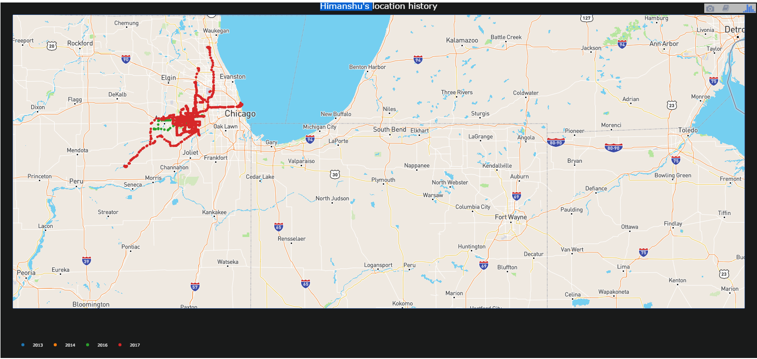
Click on the above image to see the zoomable world map. If you explore the chart , you can see that recently I have spent most of my time in Chicago, US and New Delhi,India.
Google also tracks the velocity of my movement.
Let’s first see, what velocity I have been moving over the places .
## Making velocity as category
velocity_1<- loc[!is.na(loc$velocity) ,]
velocity_1$velocity_category<- ifelse(velocity_2$velocity >=0 & velocity_2$velocity <=10, "Slow",
                                ifelse(velocity_2$velocity >=11 & velocity_2$velocity <=20, "Medium","Fast")
                                )

loc_map_2 <- velocity_1 %>%
  plot_mapbox(lat = ~lat, lon = ~lon,
              split= ~velocity_category, size=2,
              mode = 'scattermapbox') %>%
  layout(title = 'Himanshu\'s location & Velocity',
         font = list(color='white'),
         plot_bgcolor = '#191A1A', paper_bgcolor = '#191A1A',
         mapbox = list(style = 'streets'),
         legend = list(orientation = 'h',
                       font = list(size = 8)),
         margin = list(l = 25, r = 25,
                       b = 25, t = 25,
                       pad = 2))


loc_map_2

## Let's save the  plot as HTML
saveWidget(loc_map_2, file="ch3.html")
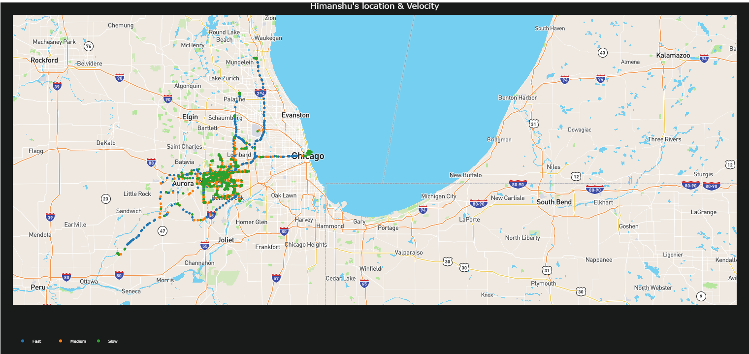
As you can see in the map, it a mix of velocity. Sometime very fast as 55 and sometime very slow 0 ( may be still that time). I relatively move faster when out of city and town area.
Average velocity per year
I jog regularly and I wanted to see if I google data tells me anything about my speed of jogs over the years.
velocity_2 <- velocity_1 [, c("velocity", "year")]
velocity_2$year <- as.factor(velocity_2$year)

v<- ggplot(velocity_2, aes(x = year, y = velocity)) +
geom_point(position = position_jitter(width = 0.1), alpha = 0.01) +
geom_boxplot(aes(color = year), size = 0.5, outlier.colour = NA) +
facet_grid(year ~ ., scales = "free") +
labs( title = "Velocity over the years")+
theme(legend.position="none")


w<-ggplotly(v)
w

## Let's save the  plot as HTML
saveWidget(w, file="ch4.html")
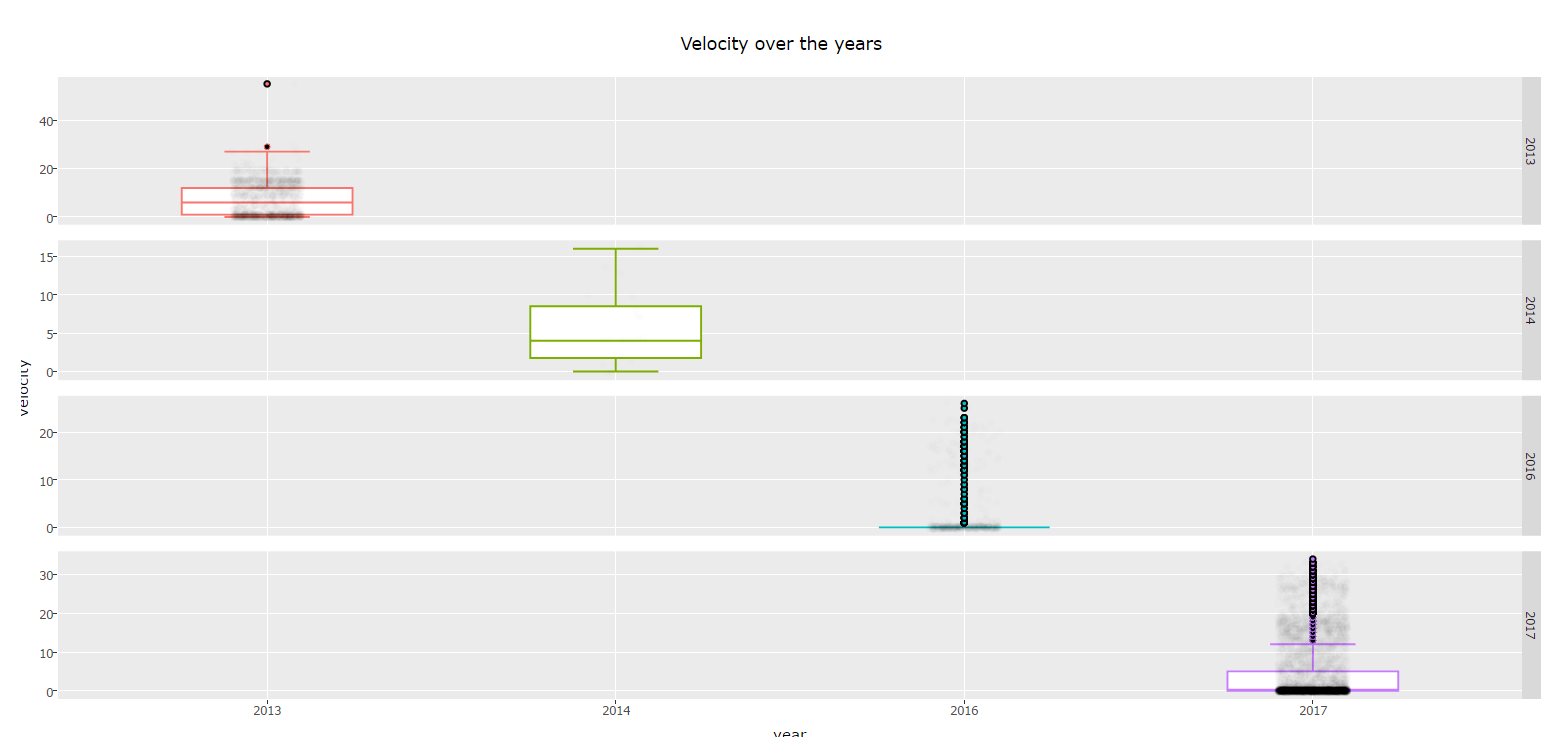 If you click on the image , you can see that median of velocity is not very informative because the points collected per year are not consistent.
Other analyses
The file also contain information about your activity and it is based on distance and velocity . I have done seperate analysis to estabablish that activity is guessed from lon, lat and velocity information. You can do it too.
Happy reading & experimenting !!